Welcome to the world of eCommerce retail, where aesthetics and functionality collide to create remarkable e-commerce experiences. Let’s explore the delicate balance between beauty and practicality and discover how it plays a pivotal role in the success of an eCommerce store and unravel the secrets to achieving a high-performing eCommerce store that captivates customers and drives conversions.
The Battle of Beauty and Practicality


Imagine walking into a physical store with stunning visual displays that leave you in awe. The ambiance, the carefully curated products, and the harmonious color palette create an enchanting experience. But as you try to navigate through the store, you find it difficult to find the products you’re looking for. The layout is confusing, and the checkout process is cumbersome. On the other hand, you enter a store with no frills, plain walls, and straightforward shelving. However, it’s incredibly easy to find what you need, and the checkout process is seamless. These contrasting scenarios exemplify the ongoing battle between aesthetics (beauty) and functionality (practicality).
Finding the perfect balance between aesthetics and functionality is the key to creating an exceptional eCommerce store. Many assume that prioritizing one over the other is the way to go, but this couldn’t be further from the truth. Let’s delve deeper into the importance of aesthetics and functionality to understand why both are crucial for a high-performing eCommerce store.


To illustrate the battle between aesthetics and functionality, let’s imagine a jewelry store. One store has elegant displays, soft lighting, and beautifully arranged pieces. The ambiance creates an emotional connection with customers, elevating the brand’s image. However, finding a specific piece or navigating the store becomes a challenging task. In contrast, another jewelry store may have a simple layout, well-organized showcases, and clear signage. While it may lack the allure of the first store, it provides a seamless browsing experience, making it easier for customers to find what they’re looking for.
Why Aesthetics Matter?
In the world of eCommerce shopping, aesthetics play a crucial role in capturing the attention of potential customers and creating a lasting impression. Here’s why aesthetics matter in an eCommerce store:


First Impressions and Branding
When customers visit an eCommerce store, their first impression is formed within seconds. An aesthetically pleasing website design can instantly convey professionalism, trustworthiness, and attention to detail. It sets the tone for the entire shopping experience and reflects the brand’s identity and values. A visually appealing eCommerce store creates a positive first impression and fosters a strong brand image.
Building Customer Trust
An aesthetically pleasing eCommerce store instills confidence in customers. When the design is visually engaging, customers perceive the brand as reputable and reliable. A well-designed store conveys that the brand cares about its customers’ experience and is dedicated to providing high-quality products and services. This builds trust, encouraging customers to explore further and make purchases.
Enhancing User Experience
Aesthetics directly impact the user experience. A visually appealing eCommerce store is more enjoyable to navigate, making it easier for customers to find products, browse categories, and complete purchases. Thoughtful design elements, such as intuitive navigation menus, clear product images, and well-structured layouts, enhance the overall user experience and keep customers engaged.
Let’s explore a few examples of eCommerce stores that have mastered the art of aesthetics:
Nisolo


This sustainable fashion brand uses a minimalist design with high-quality product imagery, elegant typography, and a cohesive color palette. The result is an eCommerce store that exudes sophistication and aligns with the brand’s values.
Rifle Paper Co.


Known for their whimsical stationery and home goods, Rifle Paper Co.’s eCommerce store features charming illustrations, playful patterns, and a vibrant color scheme. The aesthetics perfectly reflect the brand’s unique personality and evoke a sense of joy and creativity.
Allbirds
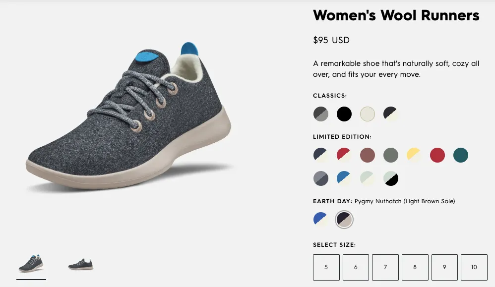

The eCommerce store of this eco-friendly shoe brand utilizes a clean and modern design. The combination of high-quality product photography, a minimalistic layout, and subtle animations creates a sense of elegance and simplicity, aligning with the brand’s commitment to sustainable and comfortable footwear.
The Power of Functionality
While aesthetics are important, a high-performing eCommerce store cannot thrive on beauty alone. The true power lies in functionality. Here’s why functionality is critical for an eCommerce store:


Usability and Intuitive Design
Functionality ensures that customers can navigate the eCommerce store effortlessly. The user interface should be intuitive, making it easy for customers to search for products, filter search results, and access relevant information. A well-designed eCommerce store anticipates user needs and provides seamless interactions, minimizing frustration and increasing satisfaction.
Efficiency and Speed
ECommerce shoppers have little patience for slow-loading websites or clunky interfaces. Functionality encompasses optimizing website performance to ensure fast loading times and smooth browsing experiences. A streamlined and efficient eCommerce store helps customers find what they need quickly, reducing the likelihood of them abandoning their shopping journey.
Conversion Rates and Sales
Ultimately, functionality directly impacts conversion rates and sales. When an eCommerce store is well-designed and functions flawlessly, customers are more likely to complete their purchases. Smooth checkout processes, secure payment gateways, and clear calls-to-action enhance the customer journey, leading to higher conversion rates and increased revenue.
Sometimes, a visually simple eCommerce store can outperform its aesthetically striking counterparts due to its exceptional functionality. Let’s explore the story of CleanSlate, a furniture retailer known for its minimalistic approach:


CleanSlate may not have the most elaborate visual design, but its focus on practicality and functionality has led to remarkable success. The eCommerce store prioritizes quick loading times, clear product descriptions, and an intuitive browsing experience. Their checkout process is seamless, with minimal steps and user-friendly form fields. As a result, CleanSlate experiences high conversion rates and customer satisfaction, proving that practicality can triumph over aesthetics.
Striking the Balance: When Beauty Meets Functionality
While aesthetics and functionality are both crucial, the real magic lies in striking the right balance between the two. Let’s explore why finding this equilibrium is essential for your eCommerce store’s success:


Enhanced User Experience
When aesthetics and functionality work together harmoniously, they create a seamless and delightful user experience. Visitors are captivated by the visually appealing design while being able to effortlessly navigate, find information, and complete actions.
Increased Engagement
Balancing aesthetics and functionality can increase user engagement and encourage visitors to spend more time on your eCommerce store. The visually appealing design hooks them in, while the user-friendly functionality keeps them engaged, exploring different products and sections.
Trust and Credibility
A balance between aesthetics and functionality instills trust and credibility in your brand. A visually appealing design communicates professionalism and attention to detail, while seamless functionality assures visitors that they can trust your eCommerce store to deliver a smooth and secure shopping experience.
Let’s take a look at some eCommerce stores that excel in striking the balance between aesthetics and functionality:
Everlane


Known for its sustainable and transparent approach to fashion, Everlane’s eCommerce store combines minimalist aesthetics with a user-friendly interface. The clean design highlights product imagery and information, while intuitive navigation and a seamless checkout process enhance functionality.
Warby Parker


This eyewear brand’s eCommerce store exemplifies the marriage of aesthetics and functionality. With a visually appealing design, high-quality product imagery, and a virtual try-on feature, Warby Parker ensures that customers have an engaging and practical shopping experience.
Etsy
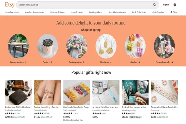

As a marketplace for unique and handmade products, Etsy strikes a balance by providing an aesthetically pleasing platform that allows sellers to showcase their individuality. While the site features a diverse range of visual styles, it maintains functionality through effective search filters, personalized recommendations, and a secure transaction process.
Tips to Achieve the Perfect Balance
Achieving the perfect balance between aesthetics and functionality requires a thoughtful approach. Here are some tips to help you strike that balance in your eCommerce store:


Understand Your Audience
Gain insights into your target audience’s preferences, demographics, and behavior to tailor the design accordingly. This understanding will guide your decisions on visual elements and functionality.
Simplify the User Journey
Streamline the user journey from arrival to checkout. Eliminate unnecessary steps, simplify the navigation, and provide clear calls-to-action to guide customers smoothly through the purchasing process.
Mobile-Optimized Design
With the increasing prevalence of mobile shopping, ensure your eCommerce store is fully optimized for mobile devices. Responsive design and mobile-friendly features will enhance the user experience and support functionality on different screen sizes.
Test and Iterate
Regularly test your eCommerce store’s design and functionality, gathering feedback from real users. Use A/B testing to experiment with different layouts, color schemes, or user flows. Iteratively refine your design based on insights gained from testing.
The Role of Testing and Feedback
Maintaining the delicate balance between aesthetics and functionality requires continuous improvement through testing and user feedback. Let’s delve into the importance of testing and feedback in creating a high-performing eCommerce store:


Usability Testing
Conduct usability tests to observe how users interact with your eCommerce store. Identify pain points, confusion, or areas where the design may hinder functionality. This valuable feedback helps uncover potential improvements and ensures a seamless user experience.
A/B Testing
Implement A/B testing to compare different design variations and functionalities. By creating two or more versions of your eCommerce store and analyzing user behavior, you can identify which elements contribute positively to aesthetics and functionality. Use A/B testing to make data-driven decisions and iterate on your design.
Customer Feedback
Actively seek customer feedback through surveys, reviews, and social media channels. Engage with customers to understand their needs, preferences, and pain points. This feedback provides insights into areas where improvements are needed and enables you to tailor your eCommerce store to better serve your target audience.
Iterative Design
Embrace an iterative design process where you make incremental improvements based on user feedback and testing results. Continuously refine your eCommerce store to strike a better balance between aesthetics and functionality over time.
In the spirit of embracing the importance of testing and feedback, let’s share a lighthearted story about a design modification that led to significant improvement:


In the early 2000s, a popular fast-food chain was experiencing a decline in customer satisfaction due to a design flaw in their packaging. The chain’s iconic burger, known for its stacked ingredients, was causing a messy eating experience for customers. As customers would take a bite, the burger would inevitably start to unravel, resulting in sauce and toppings falling onto their laps or the table.
Recognizing the need for a solution, the company decided to reevaluate the design of their burger packaging. After numerous brainstorming sessions and prototype testing, the design team came up with a simple yet ingenious modification. They introduced a secondary layer of packaging—a small, transparent sticker placed on the back of the burger, securing the top bun.
The impact of this design modification was remarkable. Customers were now able to enjoy their burgers without the fear of toppings sliding off. The sticker provided an additional layer of support, holding everything in place until each bite was taken. It created a more satisfying and less messy eating experience, resulting in improved customer satisfaction and increased sales.
This small design modification not only solved the immediate problem but also showcased the company’s commitment to addressing customer concerns and continuously improving their products. It became a topic of conversation among customers, with some playfully referring to it as the “burger-saving sticker.”
The success of this design modification highlighted the importance of paying attention to even the smallest details in product design. It demonstrated that sometimes, it’s the subtle changes that can have a significant impact on user experience and customer satisfaction.
Conclusion
Finding the right balance between aesthetics and functionality is the key to creating a high-performing eCommerce store. By prioritizing both aspects, you can capture customers’ attention with visually appealing designs while providing a seamless and efficient shopping experience.
Remember, it’s essential to understand your audience, simplify the user journey, and optimize your eCommerce store for mobile devices. Regular testing, feedback collection, and iterative design are crucial to maintaining the balance and continuously improving your eCommerce store’s performance.
Ready to create an eCommerce store that stands out in both beauty and functionality? Contact Neuroimpakt for expert assistance and guidance in designing and developing a high-performing eCommerce store that captivates your customers.
References
- “Shopify” – a reputable e-commerce platform that offers customizable themes and functionality to create visually appealing and functional eCommerce stores.
- “Smashing Magazine – Web Design Resources” – a valuable resource for web design tips, articles, and inspiration.
- Barinova, E. (2022). “Designing for Trust: Balancing Aesthetics and Functionality in E-commerce.” UX Collective.
- Tuts+ (2021). “Balancing Aesthetics and Functionality in Web Design.” Envato Tuts+
- Nisolo eCommerce Store
- Rifle Paper Co. eCommerce Store
- Allbirds eCommerce Store
- Everlane eCommerce Store
- Warby Parker eCommerce Store
- Etsy eCommerce Store

